

Experiential Graphic Design/体験型グラフィックデザイン

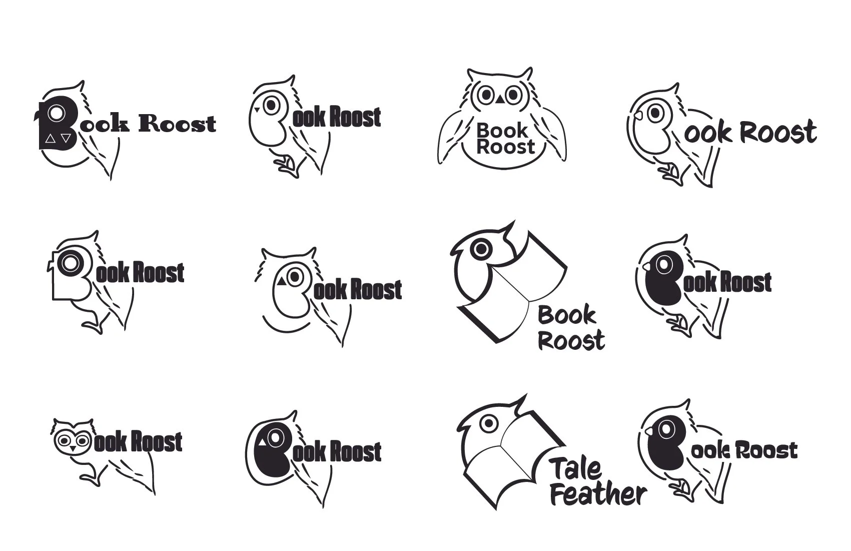

ふくろうは「かしこさ」を象徴する動物なので、「たのしく知識をつくる」という意味をこめて、ロゴにふくろうを使うことにしました。このスケッチでは、英語の “Book” にある二つの O をフクロウの目としてデザインし、さらに羽を本の形に見立てることで、ブランド名とロゴが一体となるようなビジュアルを考えました。Since owls symbolize wisdom, I decided to use an owl in the logo to express the idea of “learning and creating knowledge in a fun way. In this sketch, I designed the two O’s in the word “Book” as the owl’s eyes, and shaped the wings to resemble an open book, creating a visual concept where the brand name and logo are unified.Brand Guide Book/ブランドガイドブック

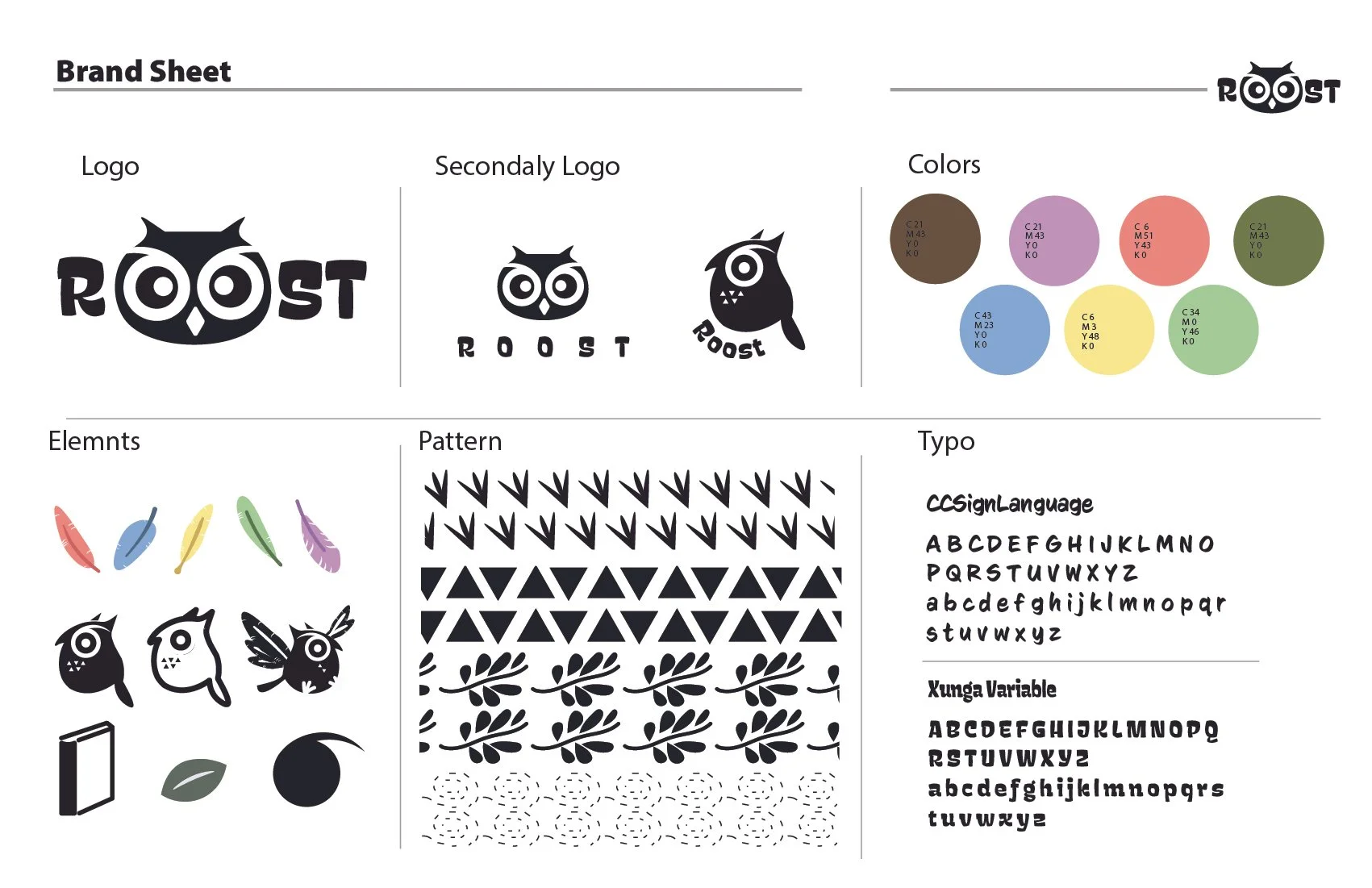
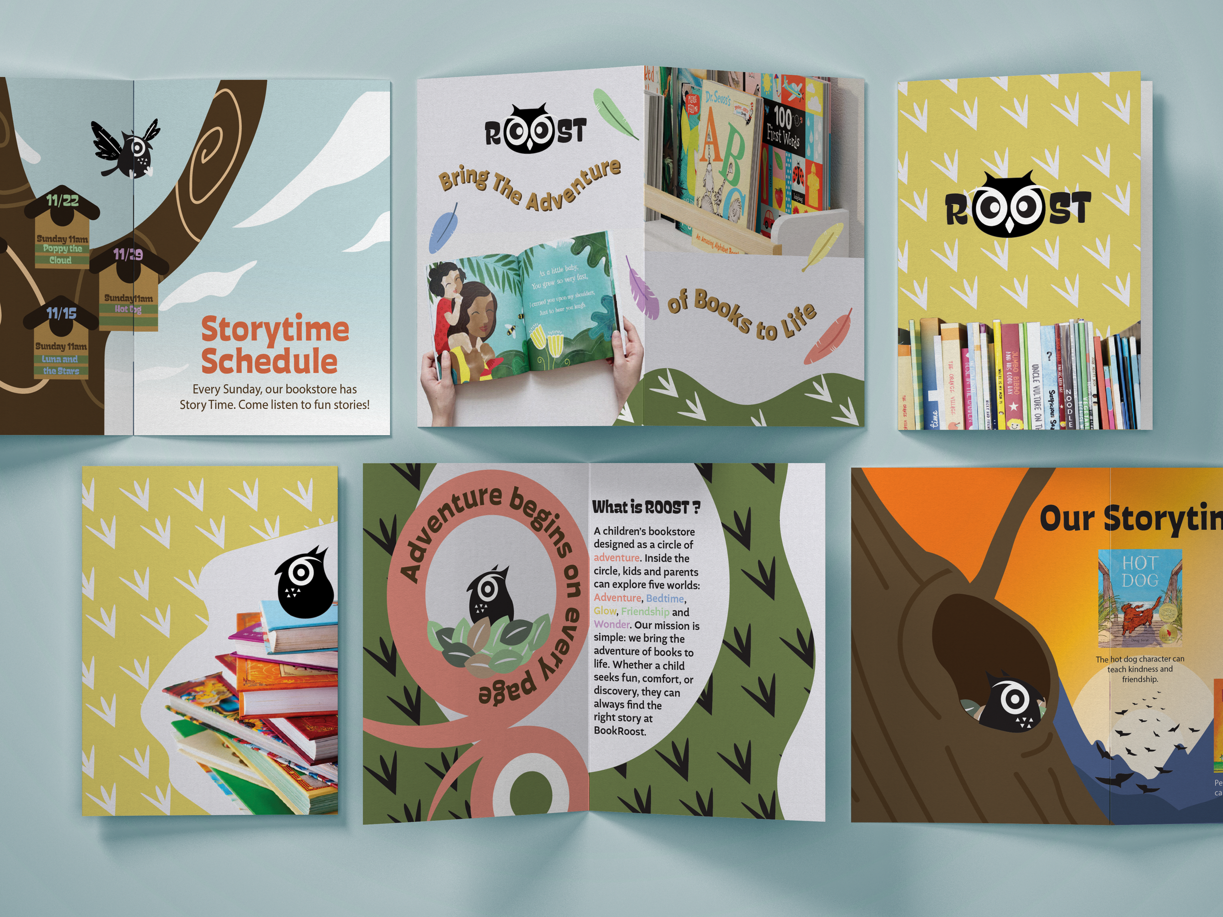
Brand Guide Book/ブランドガイドブック
Banner /バナー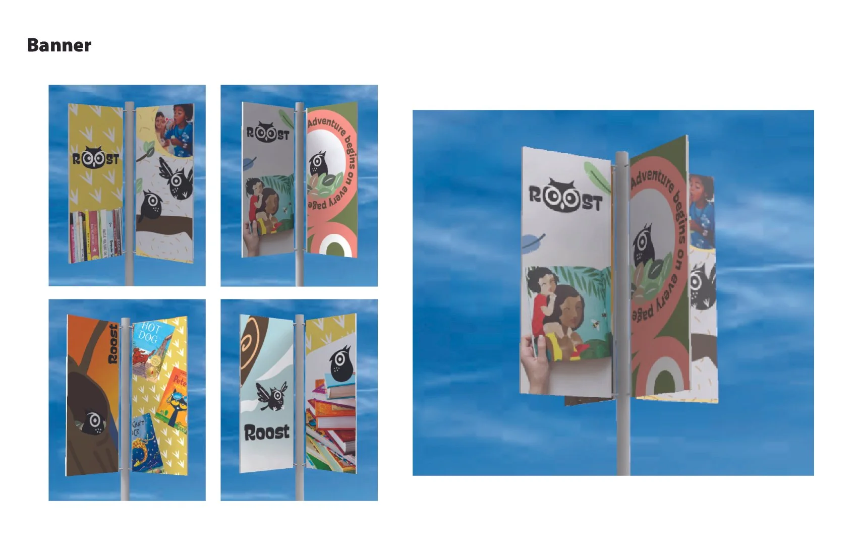
Sketche/スケッチEvent Enviroment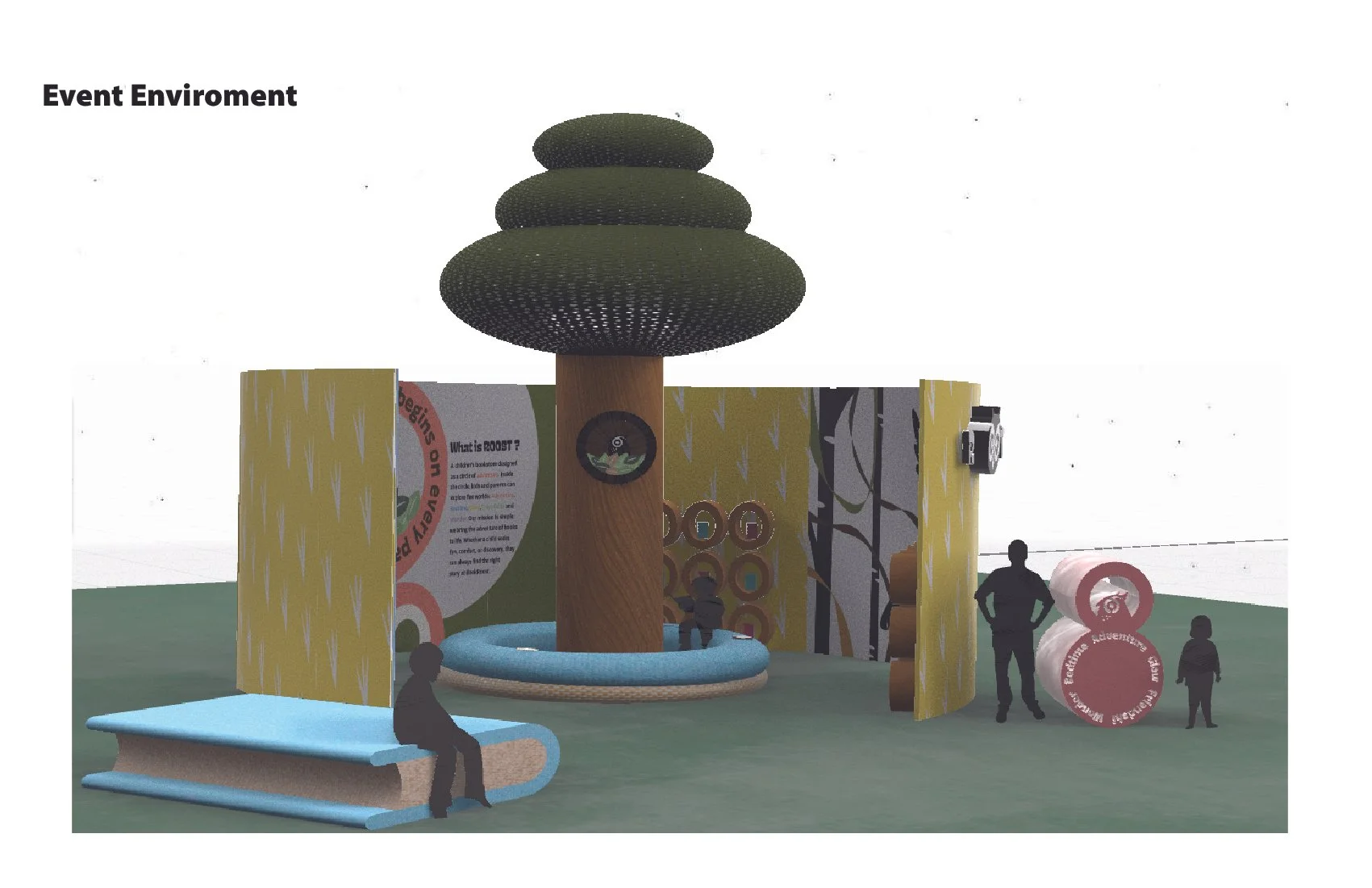
3d dimention
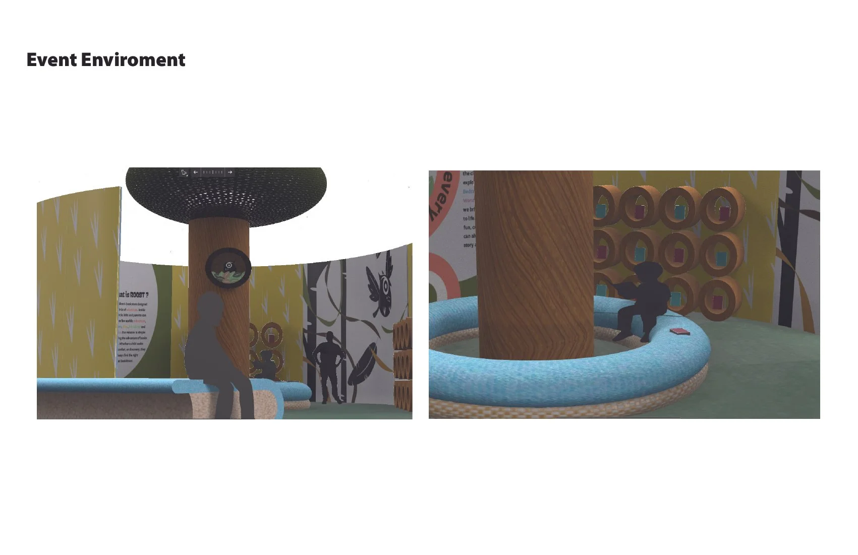
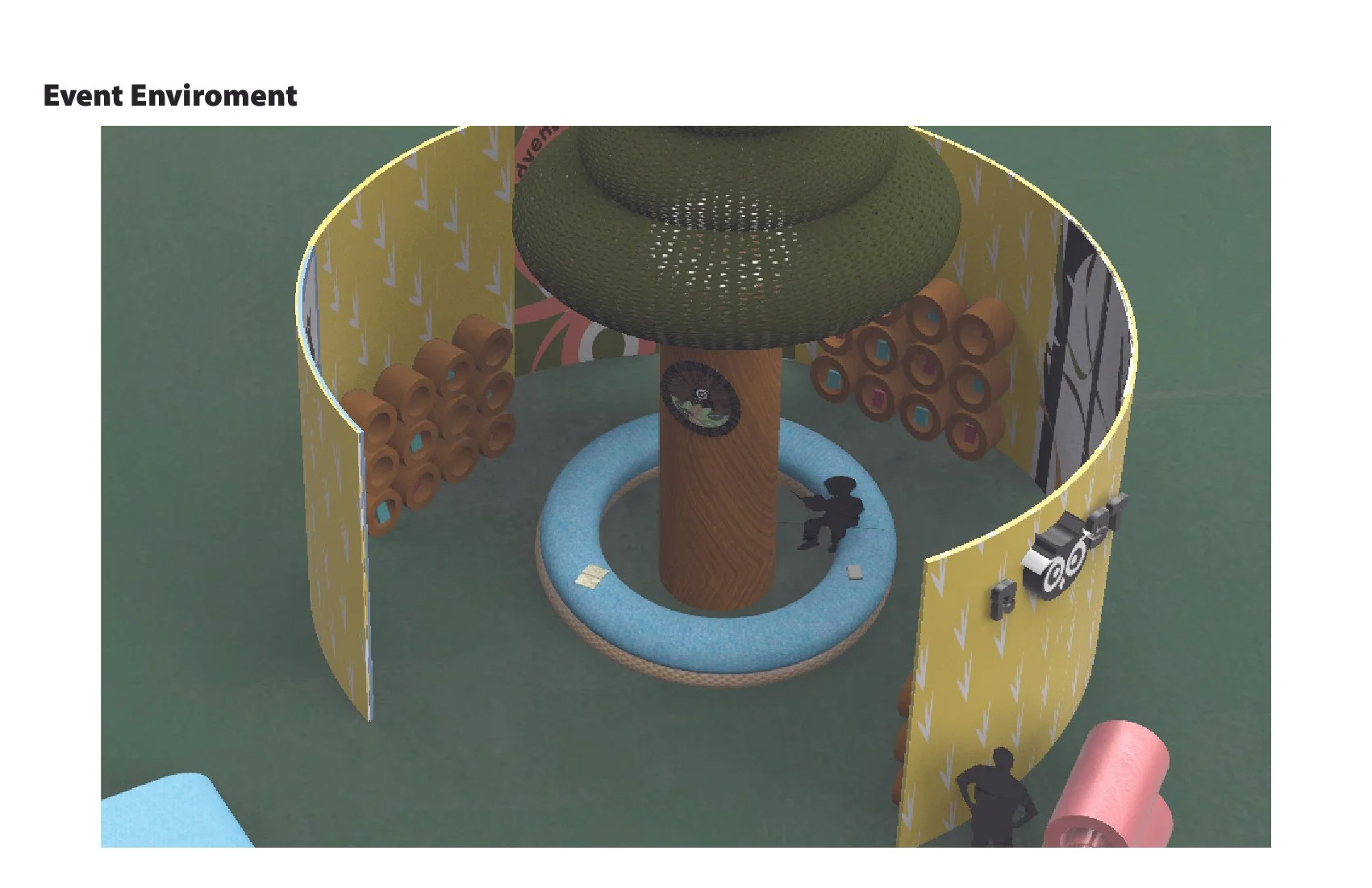
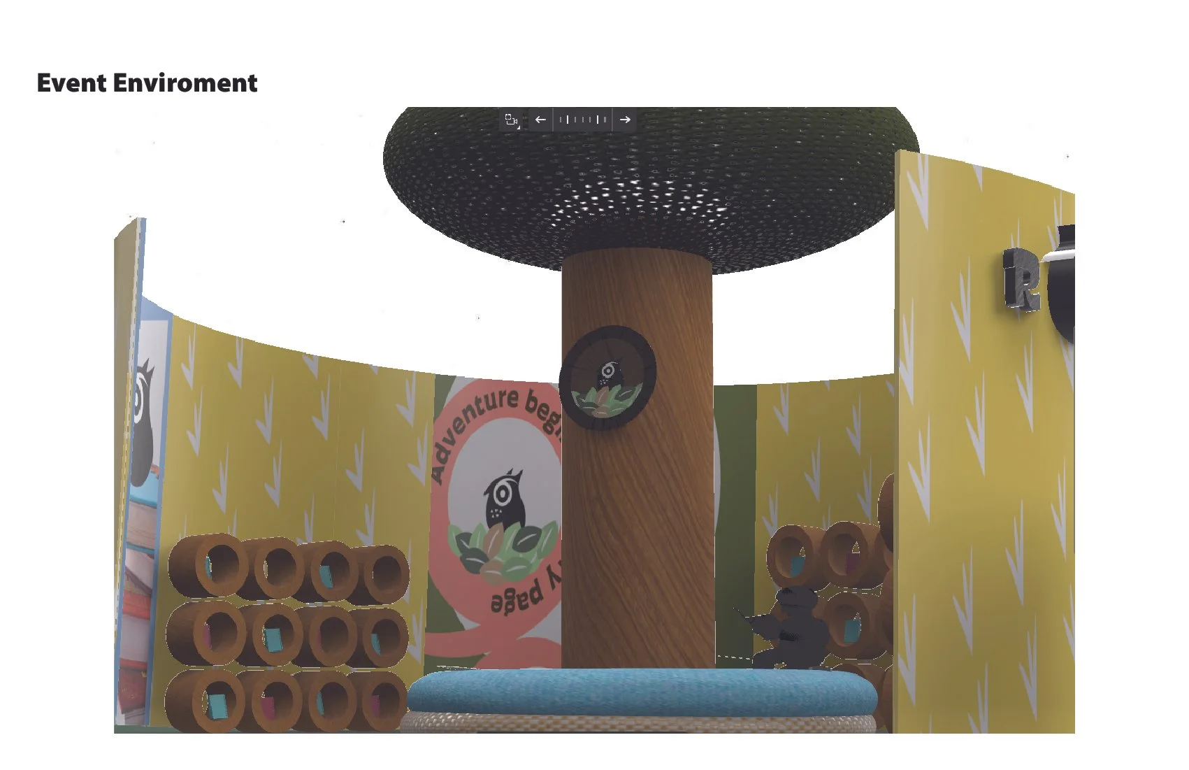
このプロジェクトでは、体験型グラフィックデザインのクラスで、ブランドづくりとイベントの企画を行いました。私がつくったブランドは「子どもの本屋さん」です。子どもが“学びを楽しめる”本を届けたいという思いから、冒険・ベッドタイムストーリー・成長・友情・好奇心の5つのテーマに分けて構成しました。本屋は円形の空間になっていて、丸い通路を回りながらテーマごとの本を見ていけるデザインです。ひと回りすると迷わず元の場所に戻れるため、子どもにとっても安心感のある構成になっています。In this project, our experiential graphic design class focused on creating a brand and planning an event. The brand I created is a “children’s bookstore.” I wanted to design a place that offers books children can enjoy learning from, so I divided the space into five themes: adventure, bedtime stories, growth, friendship, and curiosity. The bookstore is designed as a circular space, where visitors walk along a round path and explore books by theme. By completing one full loop, children can return to the starting point without getting lost, creating a sense of comfort and safety.